
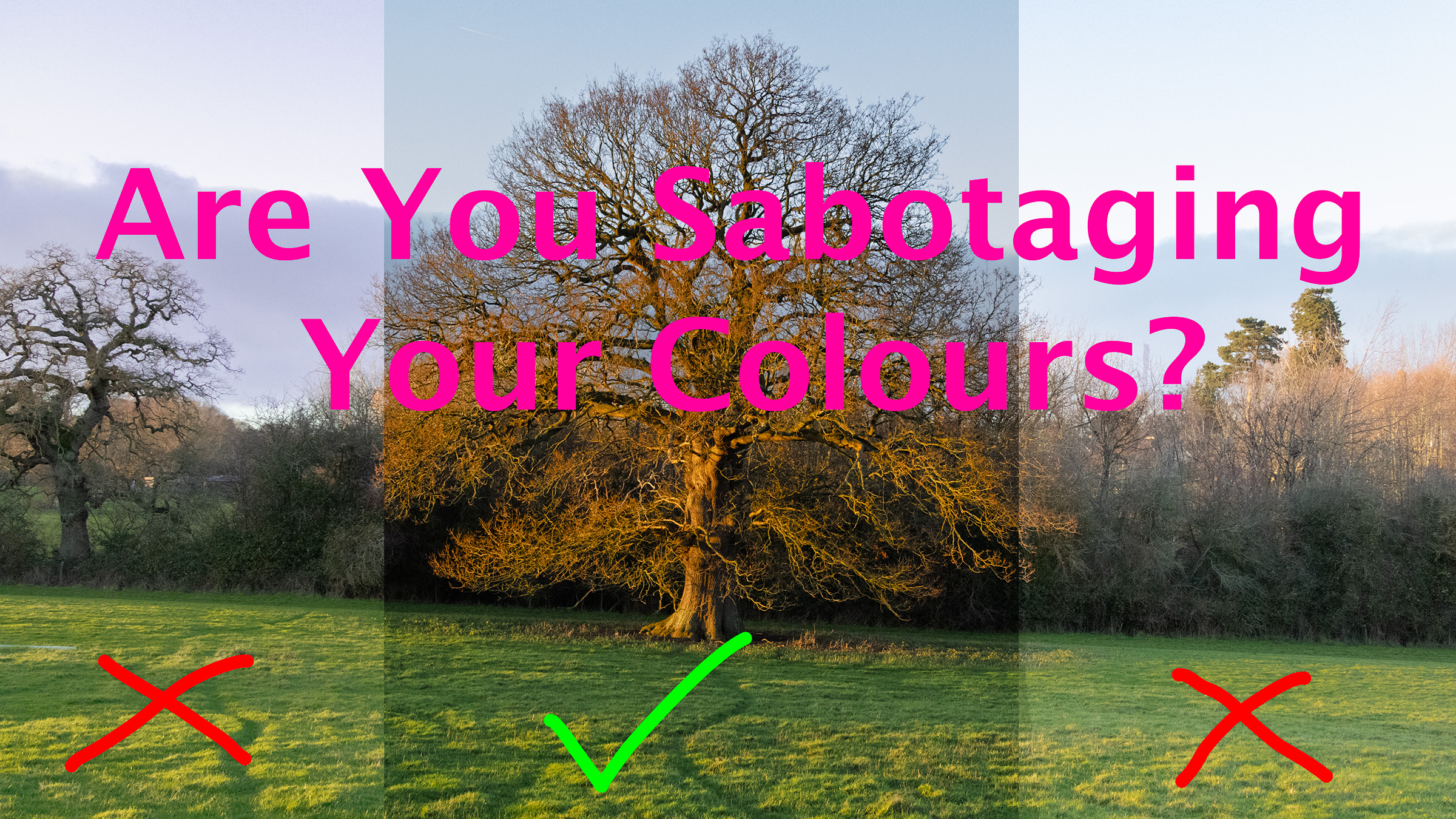
4 Common Color Issues
I suspect we all come to color image processing the same way, there are three phases we go through. Firstly the “Whack up the contrast” phase, secondly the global adjustments stage and finally the hopefully measured approach where we deploy the tools at our disposal in the way that serves the image best. I’ve been doing this for many years now and there are four common color issues I encounter all the time.
The first is the most common – the room and the lighting you work in. It took a while for me to realise the full extent of the damage that inappropriate lighting can do, I thought that my editing skills were improving until I found myself trapped by bad weather in a small cottage in Shropshire lit by a number of different lightbulbs in a room painted cream. I didn’t immediately twig, because I edit on a powerful MacBook Pro with a superb display which I assumed was overwhelming any colours introduced by the ambient light. So you can imagine my shock when I checked my social media in daylight, to find a picture that looked as orange as Donald Trump and very nearly as offensive!
The problem in this case was the yellow ambient light – our eyes adjust very quickly and so after a few minutes we’re perceiving yellow light at -3 (figuratively speaking) and so when we want to see more orange or yellow in our images we boost it above and beyond where it really should be. There are a couple of strategies to mitigate against this – use the white balance tool to set the white balance in the photograph, concentrate on the areas of the photo that look most natural and thirdly, edit either in the dark or in dim daylight – switch those lights off!
The second issue is not really an editing problem at source. When we shoot sunsets we’re used to including the sun in our frame – after all that’s why we’re shooting a sunset. But what happens when we are relying on that sinking sun for light? When I’m in Shropshire I regularly walk in golden hour to the same field, there is a series of ancient oaks there and slightly frustratingly, the most perfectly shaped example is very close to the edge of the field and the wood behind it. It has been impossible to separate the tree from the background enough to make a decent picture.
On the most recent occasion, the sun, sitting on the horizon, raking soft warm light across the ground lit up the oak tree – and not the woods behind. Eureka! I figured I had less than ten minutes to get the shot. I eventually chose to expose for the woods rather than the sky so that I could retrieve detail from the darks. I trusted the camera to record some data in the sky that wouldn’t show up on the back of the camera jpeg.
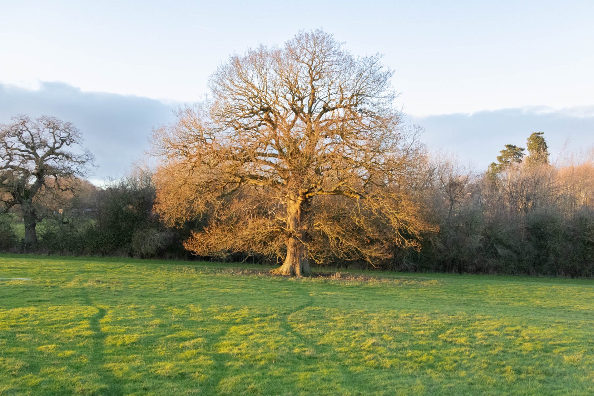
Why not bracket? Well, I didn’t necessarily want a lot of blue in the sky, there was a bank of cloud low down that would show off the warm light hitting the tree to good effect, but I didn’t want anything distracting from the tree itself. In the edit I was able to retrieve enough detail to render the sky the palest of blues and to leave the dominant colours green and orange. This produced a striking shot that I had never had the opportunity to record before.
The third scenario is Xmas lighting. We’re used to letting lights peak, but when the light is the subject we have to expose correctly for the light itself which plunges everything around it into dark.
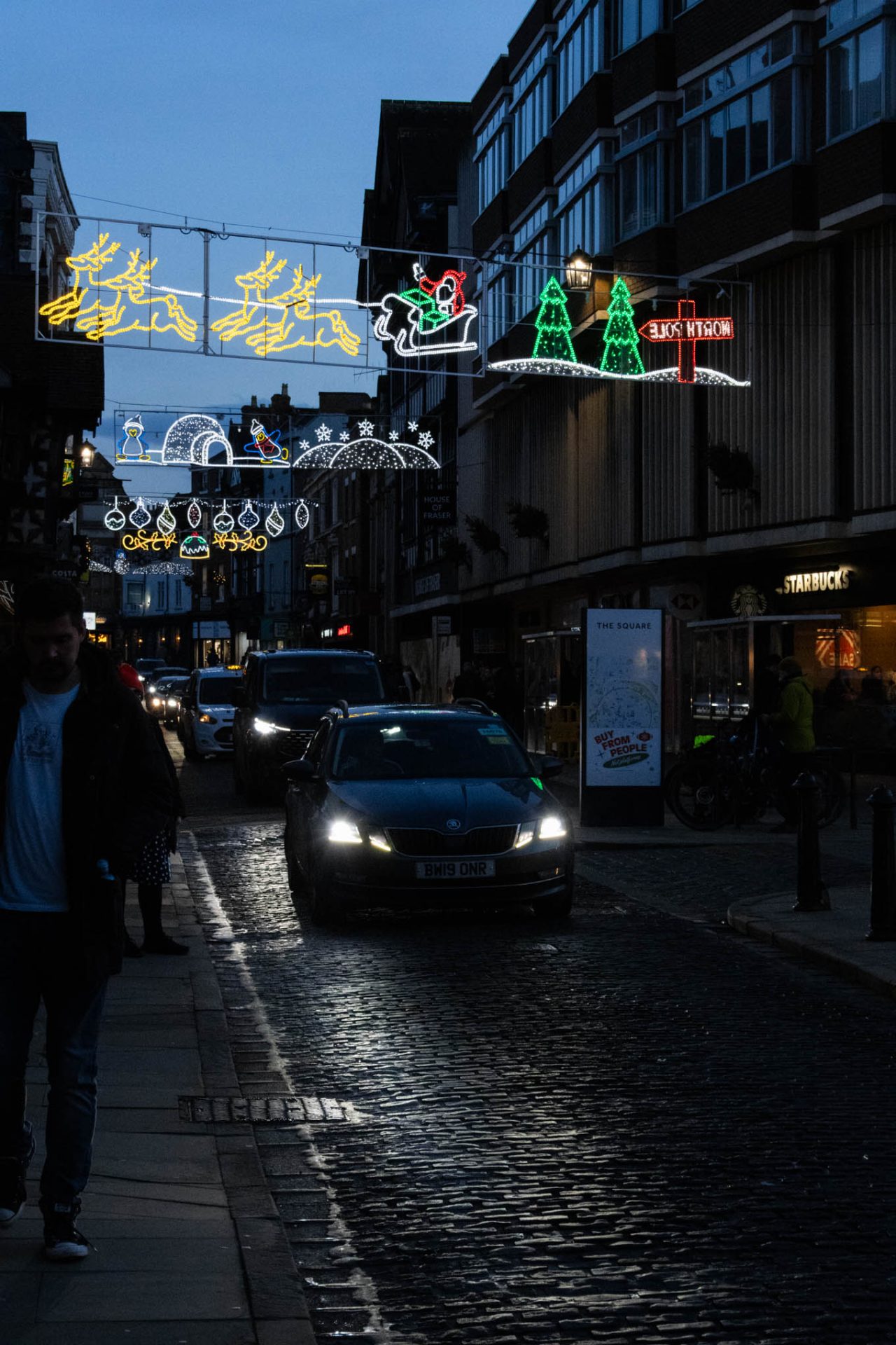
In this case I chose to break some rules and crush the blacks – I used a radial filter to enhance the throw of the headlights into the foreground, giving me enough detail to draw the eye and I used global contrast (rare for me) to enhance the contrast of the coloured items in the shot, so lights, reflections etc. The rest was a cold blue tinged darkness. If only it had rained then the street would have been much more interesting but there we are.
The last example is mixed lighting.
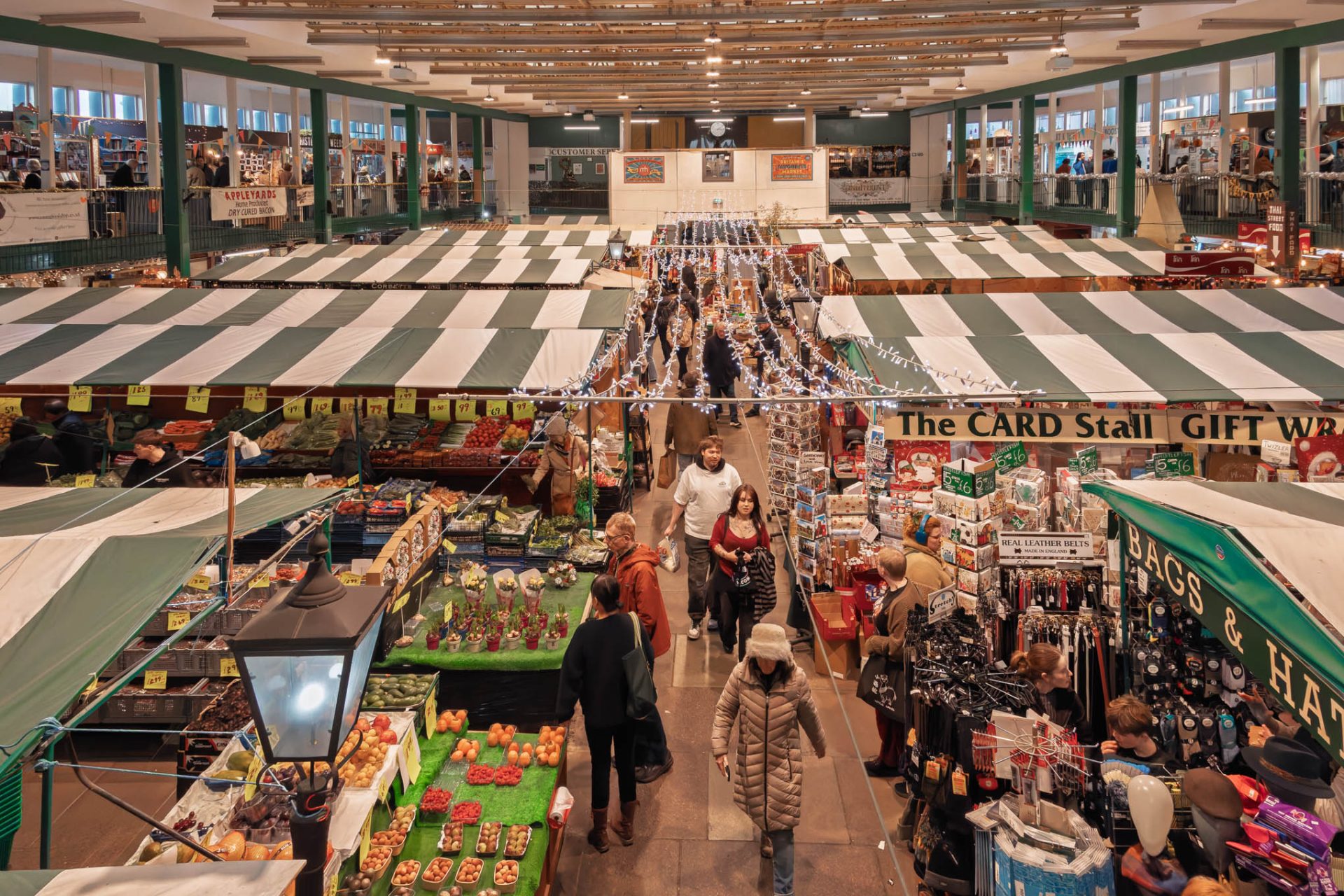
In this image you can see four different types of light source, daylight coming through the windows at the top left and right, LED lighting from the bulbs embedded in the roof and xmas lights, some kind of mock streetlamp in the foreground and whatever lights the stallholders use to light their stalls. The result is an ugly brown cast that dominates the picture.
I always advise to do color correction first and this picture is a good example of why – if I start editing from this base, then I’ll bake the cast into the image and things like contrast will start to affect the colours and not in a good way! I usually tackle this by adjusting the temperature and tint by eye but that proved near to impossible in this case. You can get locked into an endless iteration of temp adjustment, balance with tint, correct temp adjustment, rebalance etc. I tried the dropper, using the white stripes on the canvas awnings and that actually produced a pretty good balance, but I have another trick up my sleeve for this level of difficulty. Photoshop.
If you create a curves layer in photoshop you can use the auto button to have the software balance the colours – it normally does it pretty well, but if it doesn’t you can try pressing option simultaneously with the auto button and a window will pop up in which you can choose “Enhance per channel contrast” and “snap neutral midtones” this does the best job of getting rid of color casts that I’ve ever used and quite why it is so well hidden I have no idea!
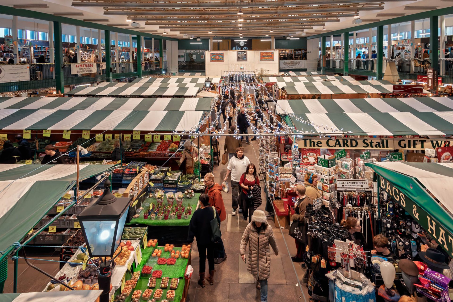
This gives me a much better starting position than I was able to achieve under my own steam.
These are the most common color issues I deal with. Broadly there are a few things I do to help mitigate issues arising from any of these problems.
- Edit in soft daylight
- Focus on the things in the picture that are most realistic when adjusting white balance
- Revisit the image, give my eyes a break
- Correct color before grading color
Hope this has been useful, enjoy your Christmas and have a happy new year!
Subscribe…
I’ll keep you in the loop with regular monthly updates on Workshops, Courses, Guides & Reviews.
Sign up here and get special prices on all courses and photowalks in 2026


